|
|
Post by wcsoxfan on Apr 6, 2021 9:19:25 GMT -5
|
|
|
|
Post by 1toolplayer on Apr 6, 2021 9:58:21 GMT -5
Fire!
|
|
|
|
Post by incandenza on Apr 6, 2021 10:05:40 GMT -5
Kinda like the colors but hate the font. We are living in a sans serif dystopia.
At least they didn't go with a lower-case 'b'.
|
|
|
|
Post by alexcorahomevideo on Apr 6, 2021 10:20:28 GMT -5
Awful. Red Sox equivalent to the Gray Celtics jerseys a couple years ago. Both should never see the light of day again. Not sure if they are as bad as the Bruins 3rd unis in the late 90s though.
|
|
cdj
Veteran
Posts: 15,932 
|
Post by cdj on Apr 6, 2021 10:32:41 GMT -5
yuck looking but I don’t care that much
|
|
|
|
Post by Chris Hatfield on Apr 6, 2021 10:36:01 GMT -5
I would love the hats... if UCLA didn't basically already use that hat, just a few shades of blue darker. I love what they were going for to associate the uniforms with the Marathon, but I'm not sure they were necessarily successful? Like I don't look at that and think "oh yeah the Boston Marathon" the same way I do when I see, say, the below. I"m sure they needed to be careful not to crib too much on the adidas design though.  |
|
steveofbradenton
Veteran
Watching Spring Training, the FCL, and the Florida State League
Posts: 1,841
|
Post by steveofbradenton on Apr 6, 2021 11:05:16 GMT -5
I never get why teams mess with the traditional look. For example: the LA Chargers should always wear the sky blue/lighting bolt look. Can't imagine the Yankees wearing yellow or orange. As much as I hate the Yanks, the pinstripes look good.
|
|
|
|
Post by julyanmorley on Apr 6, 2021 11:08:05 GMT -5
It's a nice uniform, I just don't want the Boston Red Sox wearing it.
|
|
|
|
Post by manfred on Apr 6, 2021 11:11:22 GMT -5
This is a Boston thing... I’m not from Boston, so those colors mean nothing to me, except that they remind me of the Mariners. I assume they are a reference... anyway, this neither picks my pocket nor breaks my leg.
|
|
|
|
Post by Canseco on Apr 6, 2021 11:27:57 GMT -5
Horrifying. The Red Sox have some of the most timeless, classy uniforms in sports. Don't try to reinvent the wheel in the race to maximize jersey sales. If it's about sales, then roll out home/away versions of some of the old time classics. Fans would love to buy variations of early 1900s Sox throwbacks... but this? New wave eye wash. Let's just be who we are... and that isn't some gaudy Denver Nuggets or Arizona Coyotes type of franchise.
|
|
shagworthy
Veteran
My neckbeard game is on point.
Posts: 1,874 
|
Post by shagworthy on Apr 6, 2021 11:28:29 GMT -5
I'm a bland old soul, my favorite Sox uniforms were the 80's era away grays, solid, professional, utilitarian. The font is wrong on the front of the uniform and while I get the homage to the Marathon in the theme palette just feels wrong for a team called the Red Sox to be wearing yellow and robin's egg blue. But eh, it's one game, and one uniform, I won't be purchasing one, and unless they do something historic while wearing them (A perfect game for the pitcher and every Red Sox in the lineup hits a HR) they will fade into oblivion.
|
|
KB24
Rookie
Posts: 150 
|
Post by KB24 on Apr 6, 2021 11:40:18 GMT -5
Love it! The 617 patch is a nice touch.
|
|
|
|
Post by fenwaydouble on Apr 6, 2021 11:41:52 GMT -5
I used to be a uniform purist, but if mixing things up will encourage new fans to get interested, then it's worth a try. I would rather have a wacky alternate that gets worn very infrequently than the red and blue alternates that get worn far too often.
|
|
hank
Rookie
Posts: 113 
|
Post by hank on Apr 6, 2021 11:51:24 GMT -5
It's for 2 days. Two. No need for anyone to have a coronary.
|
|
|
|
Post by bluechip on Apr 6, 2021 12:44:53 GMT -5
It's for 2 days. Two. No need for anyone to have a coronary. I’m sure it’ll be worn again. Look how often the Celtics (who have a more iconic jersey), wear their alternates. |
|
|
|
Post by Jimmy on Apr 6, 2021 13:04:35 GMT -5
They should have added “This is our F’ing City” patches seeing that these Jerseys are directly related to the “Boston Strong” movement
|
|
|
|
Post by Canseco on Apr 6, 2021 13:08:18 GMT -5
It's for 2 days. Two. No need for anyone to have a coronary. It isn’t that... it’s that this type of thing tends to have a trickling effect. The revolving door of gaudy uniforms across the NBA are revolting, and I don’t want that coming to MLB. |
|
|
|
Post by Chris Hatfield on Apr 6, 2021 13:10:02 GMT -5
I would love the hats... if UCLA didn't basically already use that hat, just a few shades of blue darker. I love what they were going for to associate the uniforms with the Marathon, but I'm not sure they were necessarily successful? Like I don't look at that and think "oh yeah the Boston Marathon" the same way I do when I see, say, the below. I"m sure they needed to be careful not to crib too much on the adidas design though.  Ian made the good point to me that they didn't really use the right shade of blue that the Marathon uses, which I think is the problem. I bet, again, they risked encroaching on either adidas' or UCLA's territory if they used a darker shade. |
|
|
|
Post by swingingbunt on Apr 6, 2021 13:50:04 GMT -5
It's for 2 days. Two. No need for anyone to have a coronary. It isn’t that... it’s that this type of thing tends to have a trickling effect. The revolving door of gaudy uniforms across the NBA are revolting, and I don’t want that coming to MLB. Tell me you're an old white guy, without telling me you're an old white guy. |
|
|
|
Post by incandenza on Apr 6, 2021 13:57:25 GMT -5
God help us if any defense of classic aesthetics can be dismissed as the domain of "old white guys."
(Which I say as an increasingly old white guy who is happily dismissive of old white guys in plenty of other domains...) |
|
|
|
Post by James Dunne on Apr 6, 2021 14:06:26 GMT -5
They don't really do it for me, but they're not horrible. Always thought an MLB City series would be a cool idea but there's nothing about this that screams BOSTON to me. It's far enough off from the marathon look that I needed to be told it was a takeoff on the marathon, I don't think I'd have picked up on that on my own. My least favorite are the camo Memorial Day ones they wore a couple years ago, though it was the hats that made those particularly bad. A random one-off alternate I liked was this random faux-back they wore in San Diego in September 2016: 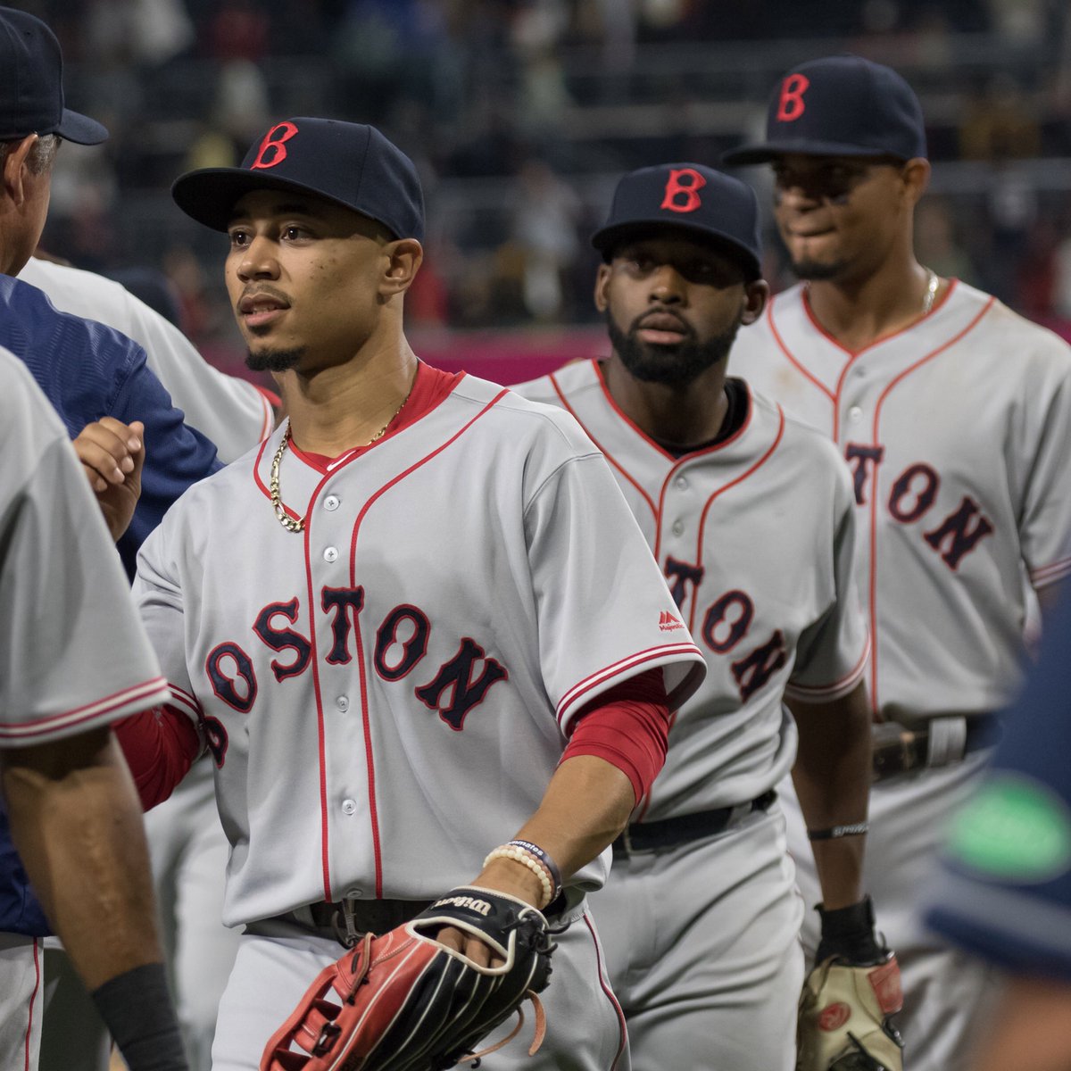 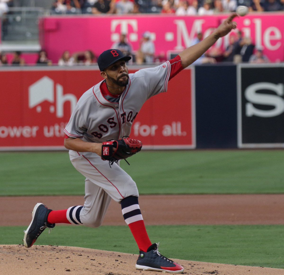 |
|
|
|
Post by jerrygarciaparra on Apr 6, 2021 14:14:12 GMT -5
Abomination.....Tragic....Appalling.....Dreadful.......Unworthy.......Revolting......i could go on and on.
It is a tradition thing.....the Friday Red is bad enough.
|
|
|
|
Post by Canseco on Apr 6, 2021 14:21:49 GMT -5
It isn’t that... it’s that this type of thing tends to have a trickling effect. The revolving door of gaudy uniforms across the NBA are revolting, and I don’t want that coming to MLB. Tell me you're an old white guy, without telling me you're an old white guy. I’m a white guy, but not an old one. Also, assuming one’s racial identity based on a message board post is not so progressive, bruh! Honestly? I’m just a uniform purist and love traditional looks. |
|
|
|
Post by Canseco on Apr 6, 2021 14:24:24 GMT -5
They don't really do it for me, but they're not horrible. Always thought an MLB City series would be a cool idea but there's nothing about this that screams BOSTON to me. It's far enough off from the marathon look that I needed to be told it was a takeoff on the marathon, I don't think I'd have picked up on that on my own. My least favorite are the camo Memorial Day ones they wore a couple years ago, though it was the hats that made those particularly bad. A random one-off alternate I liked was this random faux-back they wore in San Diego in September 2016:   Beautiful. This is what I’m talking about. Our throwbacks through the century-plus existence of the franchise would be more than sufficient to retire the red and blue softball alternates—let alone these blue and yellow travesties. |
|
|
|
Post by Chris Hatfield on Apr 6, 2021 14:26:07 GMT -5
They don't really do it for me, but they're not horrible. Always thought an MLB City series would be a cool idea but there's nothing about this that screams BOSTON to me. It's far enough off from the marathon look that I needed to be told it was a takeoff on the marathon, I don't think I'd have picked up on that on my own. My least favorite are the camo Memorial Day ones they wore a couple years ago, though it was the hats that made those particularly bad. A random one-off alternate I liked was this random faux-back they wore in San Diego in September 2016:   Beautiful. This is what I’m talking about. Our throwbacks through the century-plus existence of the franchise would be more than sufficient to retire the red and blue softball alternates—let alone these blue and yellow travesties. You do know that these weren't actual throwbacks though, right? James says as much in his post. |
|


