|
|
Post by incandenza on Apr 6, 2021 14:32:41 GMT -5
Sign me up for the faux-backs. Damn this false dichotomy of modern schlock and rigid conservatism!
|
|
|
|
Post by Canseco on Apr 6, 2021 15:07:59 GMT -5
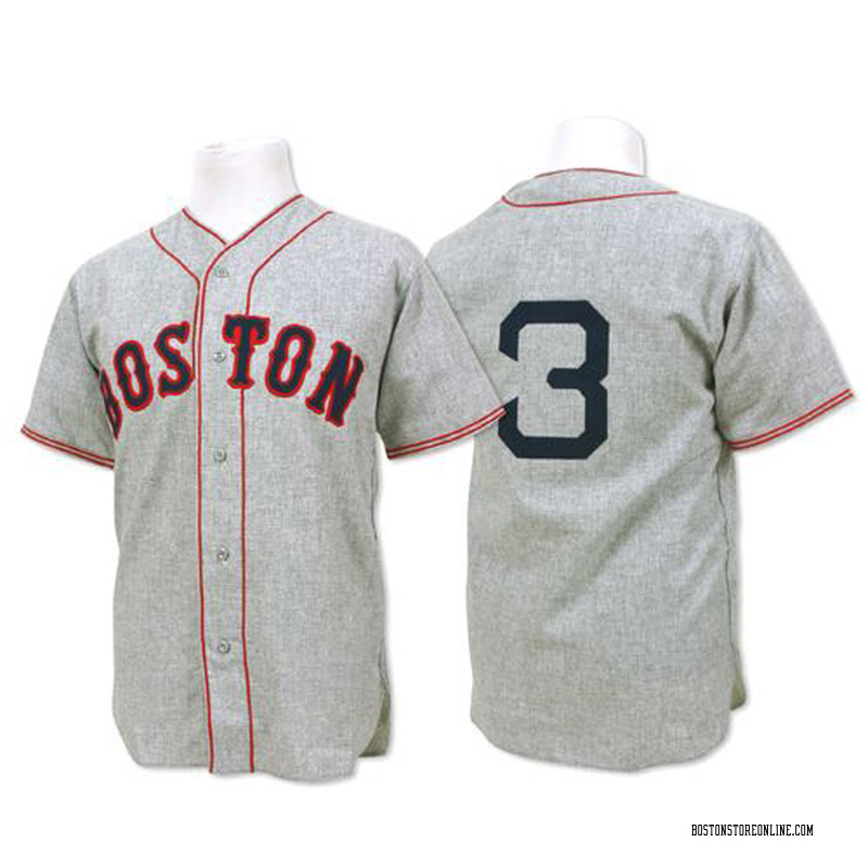
Beautiful. This is what I’m talking about. Our throwbacks through the century-plus existence of the franchise would be more than sufficient to retire the red and blue softball alternates—let alone these blue and yellow travesties. You do know that these weren't actual throwbacks though, right? James says as much in his post. Aren’t they? They look a lot like the Foxx era throwbacks pictured in the link below. Either way, that type of traditional look is what gives the franchise its identity. ![]()   1936 Jimmie Foxx Authentic Jersey 1936 Jimmie Foxx Authentic Jersey |
|
|
|
Post by pedroelgrande on Apr 6, 2021 17:13:57 GMT -5
The Denver Nuggets of baseball.
|
|
|
|
Post by Coreno on Apr 6, 2021 17:25:42 GMT -5
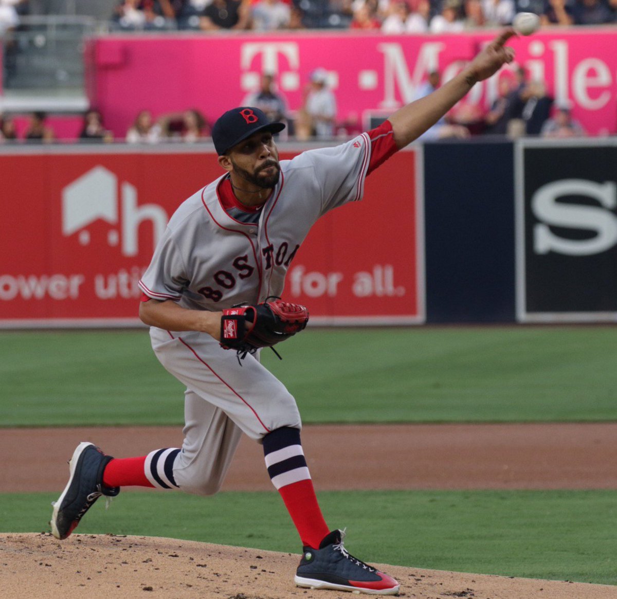
They don't really do it for me, but they're not horrible. Always thought an MLB City series would be a cool idea but there's nothing about this that screams BOSTON to me. It's far enough off from the marathon look that I needed to be told it was a takeoff on the marathon, I don't think I'd have picked up on that on my own. My least favorite are the camo Memorial Day ones they wore a couple years ago, though it was the hats that made those particularly bad. A random one-off alternate I liked was this random faux-back they wore in San Diego in September 2016:   Beautiful. This is what I’m talking about. Our throwbacks through the century-plus existence of the franchise would be more than sufficient to retire the red and blue softball alternates—let alone these blue and yellow travesties. The thing that you and James seem to be forgetting is that these faux-backs are hideous and look like Astros unis. The blue and yellow are kinda fire tho. I'm not really sure why people are worked up about a shirt and cap they'll wear twice. Even the purists must know they wear green once a year, even if it is during the spring and often not televised. Funny that the top bars on the poll currently are color-coded yellow and blue. |
|
|
|
Post by manfred on Apr 6, 2021 17:30:52 GMT -5
Hey, man, I don’t care much, but whatever wise guy voted “better than current uniforms” should be forced to rewatch last season start to finish in slow motion. Then Bobby V’s season.
|
|
|
|
Post by Legion of Bloom on Apr 6, 2021 19:41:46 GMT -5
Colors of the Boston Marathon, I like the uni honestly. Obviously if you compare them to the traditional uni’s then you won’t like it, but I believe they wanted to go bold/different.
|
|
|
|
Post by jerrygarciaparra on Apr 6, 2021 19:53:01 GMT -5
it is pretty simple.....Home - Whites, Road - Grays. Tinker with the Lettering...etc...etc....for change. As far as this one, put a commemorative patch on the uniform and call it a day !!  Add: it is apparently being at least partially driven by MLB, the way i read it. I would probably cut them some slack, if that was the case. |
|
|
|
Post by Legion of Bloom on Apr 6, 2021 19:57:09 GMT -5
So basically do the same jersey over and over again? It’s fine to do something out of the box from time to time. It’s not like they are going to use that uniform exclusively, it’s literally for 1-2 days.
|
|
|
|
Post by jerrygarciaparra on Apr 6, 2021 19:57:27 GMT -5
Hey, man, I don’t care much, but whatever wise guy voted “better than current uniforms” should be forced to rewatch last season start to finish in slow motion. Then Bobby V’s season. Ha. Was that you Manfred ? LOL. |
|
|
|
Post by foreverred9 on Apr 6, 2021 20:16:44 GMT -5
I would love the hats... if UCLA didn't basically already use that hat, just a few shades of blue darker. I love what they were going for to associate the uniforms with the Marathon, but I'm not sure they were necessarily successful? Like I don't look at that and think "oh yeah the Boston Marathon" the same way I do when I see, say, the below. I"m sure they needed to be careful not to crib too much on the adidas design though.  Ian made the good point to me that they didn't really use the right shade of blue that the Marathon uses, which I think is the problem. I bet, again, they risked encroaching on either adidas' or UCLA's territory if they used a darker shade. Agreed, I was pretty confused when I saw the initial pick, it didn't immediately make me think marathon and I'm sure 95% of America will be thinking the same. If they're going to be unrecognizable and use that ridiculous font, then they could have at least made it say "BAA's town" to make it more obvious. This reeks of a graphic designer more focused on getting the most aesthetically pleasing mix of yellow and blue rather than the true colors. Here's the logo for this year (not to mention blue is the dominant color, although the runners shirts usually have yellow dominant):  |
|
|
|
Post by soxinsf on Apr 6, 2021 20:48:55 GMT -5
I don’t know the niceties of working with the Marathon, but if the reason behind the new design is to reflect both the heritage and importance of the marathon, as well as to incorporate the pride that developed around BOSTON STRONG, then this proposal does not come close.
But I like the idea better than Celtic green or camo or gray.
How about BOSTON lettering in the existing font and a patch that references either Boston Strong or the Marathon itself. 617 doesn’t say enough.
|
|
|
|
Post by Coreno on Apr 6, 2021 23:01:10 GMT -5
In regards to the font: /cdn.vox-cdn.com/uploads/chorus_image/image/31603343/186633630.0.jpg) |
|
|
|
Post by jkfer98 on Apr 6, 2021 23:54:43 GMT -5
I like the design. But I'll be upset if Nike makes MLB go the route of the NBA where these alternates wind up getting worn 50% of the time and you can't even tell who is playing who. Wear these a few series' every year, sure, whatever. I just absolutely hate what Nike has done with the NBA uniforms and fear that will be coming our way down the road.
Having said that, if we're going to be doing alternates, lets get those 1975 throwbacks in the mix.
|
|
|
|
Post by Oregon Norm on Apr 7, 2021 0:42:28 GMT -5
I like the color scheme quite a bit, the combination of the pants and the jerseys. I know there's some symbolism involved, but the design alone appeals to me. Sorry, but I could care less about what they wore in the past.
|
|
|
|
Post by johnsilver52 on Apr 7, 2021 2:58:15 GMT -5
It's for 2 days. Two. No need for anyone to have a coronary. More like trips to the head to relieve themselves after looking at such an awful thing. Ugliest ever? Colorful double knits some teams wore from 80's were brutal, this is worse. |
|
|
|
Post by adiospaydro2005 on Apr 7, 2021 3:27:16 GMT -5
Are the Red Sox auctioning off the jerseys to raise money for local charities?
|
|
hank
Rookie
Posts: 113 
|
Post by hank on Apr 7, 2021 10:01:11 GMT -5
Colors of the Boston Marathon, I like the uni honestly. Obviously if you compare them to the traditional uni’s then you won’t like it, but I believe they wanted to go bold/different. ^ This Like or dislike the uni itself it it's to honor the Marathon and bombing victims. It's only 2 days folks |
|
mobaz
Veteran
Posts: 3,056
|
Post by mobaz on Apr 7, 2021 11:54:24 GMT -5
 Tried and failed to post this successfully yesterday. This is the best alternate jersey! Hoping they come up with a few more soon |
|
|
|
Post by Soxfansince1971 on Apr 7, 2021 21:03:14 GMT -5
I never get why teams mess with the traditional look. For example: the LA Chargers should always wear the sky blue/lighting bolt look. Can't imagine the Yankees wearing yellow or orange. As much as I hate the Yanks, the pinstripes look good. Speaking of the Chargers colors.....the RED sox will win as many World Series titles as the Chargers Super Bowls with that uniform which is 0. Like the colors on someone else. |
|
|
|
Post by swingingbunt on Apr 7, 2021 21:27:32 GMT -5
I never get why teams mess with the traditional look. For example: the LA Chargers should always wear the sky blue/lighting bolt look. Can't imagine the Yankees wearing yellow or orange. As much as I hate the Yanks, the pinstripes look good. Speaking of the Chargers colors.....the RED sox will win as many World Series titles as the Chargers Super Bowls with that uniform which is 0. Like the colors on someone else. You're right. They probably won't win a world series this year on either of the two dates they plan on wearing them. |
|
|
|
Post by soxinsf on Apr 17, 2021 16:33:35 GMT -5
These yellow and baby blue uniforms are worse in person than they seemed like they might be two weeks ago.
OK, they are meant to honor the Marathon, although I have never associated those colors with the Marathon. And I paid attention to it. My college roommate ran in it.
But even forgiving all that, for the ongoing affection we have for the Marathon and its place in the Boston sports firmament, I would have preferred to see Boston spelled out in Red Sox script than in what they have chosen. And, notice please, that the B on the caps is in Red Sox script.
I hope it sells a lot of replica uniforms. As for me, I will honor the Marathon in my Boston Strong T Shirt.
|
|
|
|
Post by iakovos11 on Apr 17, 2021 19:29:27 GMT -5
I thought they looked a TON better in person.
Not arguing colors are good/bad, not in sync with Boston Marathon, confused with UCLA, etc, etc. But they are better in person than I had expected. IMHO.
|
|
|
|
Post by James Dunne on Apr 17, 2021 20:04:39 GMT -5
I thought they looked a TON better in person. Not arguing colors are good/bad, not in sync with Boston Marathon, confused with UCLA, etc, etc. But they are better in person than I had expected. IMHO. I agree with all of this. Whether or not I love them as Red Sox uniforms, they are pretty sharp looking. If an expansion team rolled out with uniforms like this I would be down. |
|
mobaz
Veteran
Posts: 3,056
|
Post by mobaz on Apr 17, 2021 20:05:34 GMT -5
I got a hat. Not something I typically do, but it was different and fun.
|
|
|
|
Post by Coreno on Apr 17, 2021 20:09:36 GMT -5
With how strong reactions to the Sox uniform have been, I really can't wait to see people sink Manhattan when the Yankees wear like... bright red "Big Apple" uniforms or something. Dragging this in here because I want to speak it into existence, and not let it get lost in the gameday thread. |
|


